As you may be able to see from our website, we are renewing our High Performing Solutions (HPS) labels. The idea behind this redesigning is to create new labels, that could catch the essence of the range and mirror the high-quality products. And we are very proud to show you the results.
Compared to the previous labels, the new ones incorporate fresh elements, such as the colored backgrounds, and different spacing to highlight the relevant information. Across the label, you can easily identify the main takeaway and the application form written on the front. Thoroughly designed to meet our partners’ needs, more space is given to the informational text, the USP’s, and the dosing table. Also, there’s a particular place assigned to our partners’ logos. But let us explain the concept behind these designs per groups:
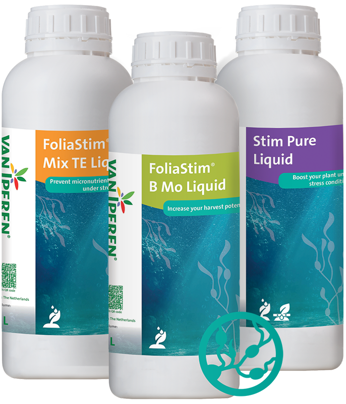
- Algae Solutions: the new label design reflects the revolutionary approach of these products with a human touch. By using the sea atmosphere, we wanted to establish a connection between the raw material and its origin. At the same time, putting in the seaweed drawings is a way to emphasize the human added value of the product, which connects to our knowledge and expertise.
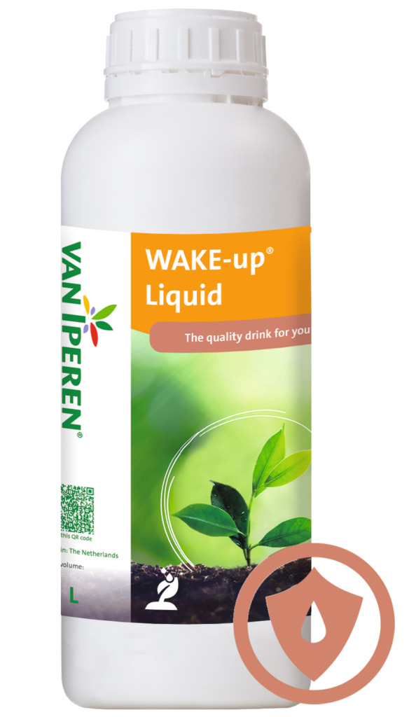
- WAKE-up® Solution: following the same set criteria, we wanted to fresh up one of our most-selling solutions. With a vibrant background, we intended to recreate a natural setting for one particular plant. Darker colors mix with brighter ones recreating a scenario that connects to the perfect balance needed by healthy plants to grow. In this case, the drawing talks about the particular protection provided by the WAKE-up® solution and its crucial impact on plant growth.
![]()
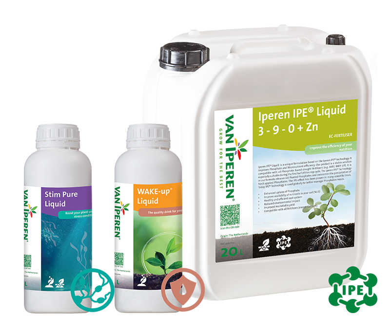
- IPE® Technology: putting into context a plant helps to tell our story better. That’s the reason for having picked again such a realistic scenery as background. Together with the drawing of the roots into the soil, it depicts precisely the efficiency of these high performing fertilizers. In the end, it’s all about enhancing the plant for the first half of the crop cycle.
In summary, more colors with pictures in the background, a clear high-quality positioning, and the essence of Van Iperen brand recognition: the left white banner with the logo. New fresh-up label designs for Van Iperen fertilizers, Where Nutrition meets Biostimulation™.